High Converting Landing Pages for Brain Retraining Academy
Creating a high converting landing page for your brain retraining academy is no longer optional — it’s the core of how you attract, convert, and retain your ideal students. Whether you’re launching a neuroplasticity-based course or a cognitive health program grounded in the latest science, your landing page is your digital handshake. It has to be trustworthy, magnetic, and precise.
At NeuroTechInsider.com, we’ve tested and reviewed hundreds of wellness and brain tech tools — from NeuroVIZR to Sensate and Apollo Neuro. One pattern always stands out: great tech and programs don’t sell themselves — but great landing pages do.
Let’s explore the first crucial half of how to build a landing page that doesn’t just look good but converts like crazy.
Why Landing Page Conversion Matters for Brain Academies
If your goal is to boost memory, reduce stress, or teach students how to rewire their brain through science-backed training, you need to understand this:
People don’t buy education—they buy transformation.
- Your page needs to promise outcomes right away.
- It must reduce skepticism using social proof and credibility.
- And it should guide people seamlessly toward a decision: sign up or start learning now.
In a competitive space where platforms like Mindvalley and Coursera are crowding attention, your academy must lead with clarity, science, and simplicity.
Understanding Your Audience: Who Are You Really Talking To?
Before you write a single headline, ask yourself:
- Are my users familiar with terms like neuroplasticity or do I need to explain the basics?
- Do they struggle with ADHD, burnout, anxiety, or sleep issues?
- What real-world outcomes are they looking for — more focus? Better moods? Deeper sleep?
This clarity informs everything — from the words you use, to the colors, to the testimonials you feature.
Core Elements of a High-Converting Brain Training Landing Page
Let’s break down the non-negotiable components that make or break your conversion rate:
1. Compelling, Outcome-Focused Headline
Your headline is the most important real estate on the page. Avoid generic titles like “Welcome to BrainX Academy.” Instead, use direct, benefit-driven language like:
- “Transform Your Focus: 6-Week Brain Retraining That Works”
- “Scientifically Proven Cognitive Reset – No Pills Required”
Here’s a great example of a strong visual hero section from Unbounce:

2. Clear and Unique Value Proposition
This is where you answer the golden question: Why should someone learn from you and not YouTube or a cheap Udemy course?
Example:
“Unlike generic online courses, our brain retraining method is backed by neuroscience, peer-reviewed research, and tested on over 12,000 students worldwide.”
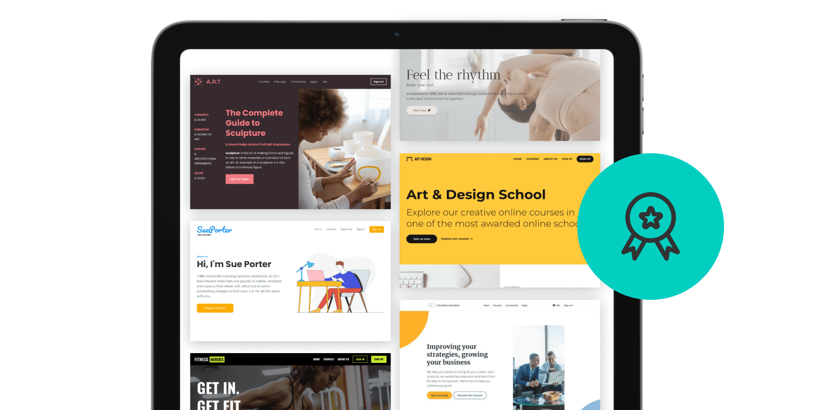
3. Eye-Catching, Trust-Building Visuals
Visuals either make or break trust. Use:
- Instructor images with friendly, confident expressions
- Visuals of your course interface
- Brain imagery that evokes science and innovation
Check this clean, high-converting layout for inspiration:
4. Testimonials and Social Proof
People trust people. A well-placed testimonial that addresses a fear or concern is far more powerful than paragraphs of copy.
Format them like this:
“I’ve tried every ADHD treatment under the sun — but this course taught me how to self-regulate using real science. Within 3 weeks, I was sleeping better and getting my tasks done.”
— Julia M., UX Designer
Make sure to include full names, photos (if possible), and even short video clips when available.
5. Repeated and Strategic Call-to-Actions (CTAs)
Don’t just ask people to “Join Now.” Instead, match your CTA with their journey:
- Above the fold: “Start Your Cognitive Reset — Free Intro Lesson”
- After social proof: “See If This Program Is Right for You → Take the 2-Min Quiz”
- End of page: “Ready to Rewire Your Brain? Join 12,000+ Students Today”
Each CTA must be large, colorful, and action-oriented. Here’s a smart example of layout and CTA positioning from OptimizePress:

Design Psychology Tips that Drive Conversions
Reduce Cognitive Load
Stick to one idea per section. Avoid clutter. White space is your friend. Want an example? Look at ClickMinded’s minimalist course pages.
Use Neuroscience-Based Content Chunks
Split benefits into groups of 3–4. Use icons and short bullet points to help users scan faster. Example:
- Boost attention span in under 14 days
- Reduce cortisol with daily neuro-breathing
- Improve memory retention with visual sequencing drills
Create Urgency with Limited-Time Offers
People don’t act unless nudged. Use countdown timers, phrases like “Only 12 seats left,” and early-bird bonuses to compel immediate action.
Want proof? Check how LearnWorlds does it below:

Coming up in the second half: We’ll dive into structuring your page section-by-section, optimization for mobile, and breakdown real-life examples from successful brain training academies. Stay tuned — or if you’re ready to level up now, let’s get to work.
Structuring Your Page: Brain Academy Page Blueprint
Now that you’ve nailed the fundamentals—headline, visuals, CTAs—it’s time to put it all together in a high-converting landing page layout. This structure ensures your visitor gets hooked, informed, and ready to convert.
Hero Section: First Impressions Matter
Your hero section should include:
- A bold, benefit-driven headline (not your logo)
- A subheadline that explains what they get and how fast
- A striking image or video showing transformation
- Primary CTA like “Start Free Class” or “Take the Assessment”
Look at how our deep comparison page for Apollo Neuro, Sensate, and NeuroVIZR uses this model to pull users in with clear benefits and data-backed value from the very first scroll.
Benefits Section: Why Join Your Program
Next up, make your value tangible. Use iconography, concise copy, and social reinforcement to highlight:
- Reduced stress and cortisol in 2 weeks
- Noticeable improvements in focus, memory, or mood
- Peer-reviewed curriculum or instructor credibility
- Lifetime access, bonuses, or certification included
Each benefit should directly tie back to the problems your user is trying to solve—like insomnia, ADHD, or chronic stress.
“How It Works” Walkthrough
People want to know what they’re getting into. Lay it out in 3–5 simple steps:
- Take a short cognitive assessment
- Get a personalized training roadmap
- Watch bite-sized, science-based video lessons
- Track improvements using brain performance tests
Want inspiration? See how LearnWorlds simplifies complex learning flows into digestible steps.
Instructor & Certification Info
Trust skyrockets when you showcase who’s behind the course. Include:
- Short bios with academic or clinical credentials
- Clear photos with friendly, confident expression
- Recognition or media mentions (e.g. “As seen on Psychology Today”)
FAQ & Objection Handling
Address the biggest friction points that prevent conversions. Use FAQs to overcome psychological resistance:
Is this program backed by science?
Yes — our curriculum is based on evidence from cognitive behavioral neuroscience, supported by peer-reviewed studies and neuroplasticity research. We continuously benchmark tools like NeuroVIZR and Sensate for efficacy and safety.
How long until I see results?
Most students report noticeable improvements in focus and mood within the first 7–14 days when following the recommended practice schedule (20–30 min/day).
What if I’m not tech-savvy?
No problem. Everything is explained step-by-step. Our support team is just one click away if you get stuck.
Final CTA and Social Reinforcement
Now that trust is built and curiosity is high, it’s time to convert. Repeat your call to action with urgency:
“Join 12,000+ students who’ve already transformed their cognitive health. Enroll now — enrollment closes in 48 hours.”
Bonus tip: Place a short testimonial or certification badge near this final CTA to reinforce decision-making.
Mobile Optimization and Page Speed
60–70% of your traffic will come from mobile. If your page lags or scrolls awkwardly, you’ll bleed conversions.
Use tools like:
Also, compress images using tools like TinyPNG without sacrificing clarity.
Real Examples of High Converting Landing Pages
Need some proven examples to model your design after? Here are 3 high-performing pages that use many of the techniques we’ve discussed:
Example 1: Mind Refresh Template
- Bright, calming visuals aligned with cognitive wellness
- Simple form and benefit-led copy
- Trust badges and user testimonials placed upfront
Example 2: ClickMinded Course Page
- Minimalist layout with clear navigation
- Short, punchy CTAs repeated throughout
- Instructor photos + credentials right under hero
Example 3: LearnWorlds Academy Template
- High-converting layout with educational trust signals
- Video walkthroughs and clean mobile design
- Urgency-based limited-time enrollment CTA
Common Mistakes to Avoid
Here are a few pitfalls that sabotage even the most beautifully designed landing pages:
- Too much jargon — speak human, not scientific abstracts
- Only one CTA — give multiple chances to act
- Slow loading — especially due to uncompressed videos/images
- Not testing mobile — always preview your design on multiple devices
- No social proof — even a single review builds trust fast
Final Thoughts and Action Steps
If you’re serious about building a thriving brain retraining academy, your landing page is the front door. Make it personal. Make it powerful. And make it work.
Here’s what to do next:
- Audit your current page: Are you using clear CTAs, strong headlines, and social proof?
- Check mobile responsiveness and speed today — not tomorrow.
- Study the templates and examples above. Steal what works, discard what doesn’t.
- Need help choosing the right cognitive tech to complement your program? Visit NeuroTechInsider.com for data-backed reviews and side-by-side comparisons of the best non-invasive neurostimulation tools on the market.
Your students are searching for solutions. A great landing page makes you the solution they find — and trust.
Want to go deeper? Browse our breakdown of top wellness devices like NeuroVIZR, Apollo Neuro, and Sensate to integrate complementary tech into your training funnel.